Our designer posted a video update about the new graphics we have been preparing for komodoplatform.com – and the design/branding choice we have to make.
I do like the aura/ night theme, it goes very well with the Komodo Logo and our community values, espically the picture with the man holding onto the flash light.
On the other hand, he did mentioned he wanted to add the 3D laptop w/ the phones onto the pictures. To be honest, i don’t think it goes well. Feels like putting a sticker onto something. I would rather have the Komodo logo in the background or a block floating.
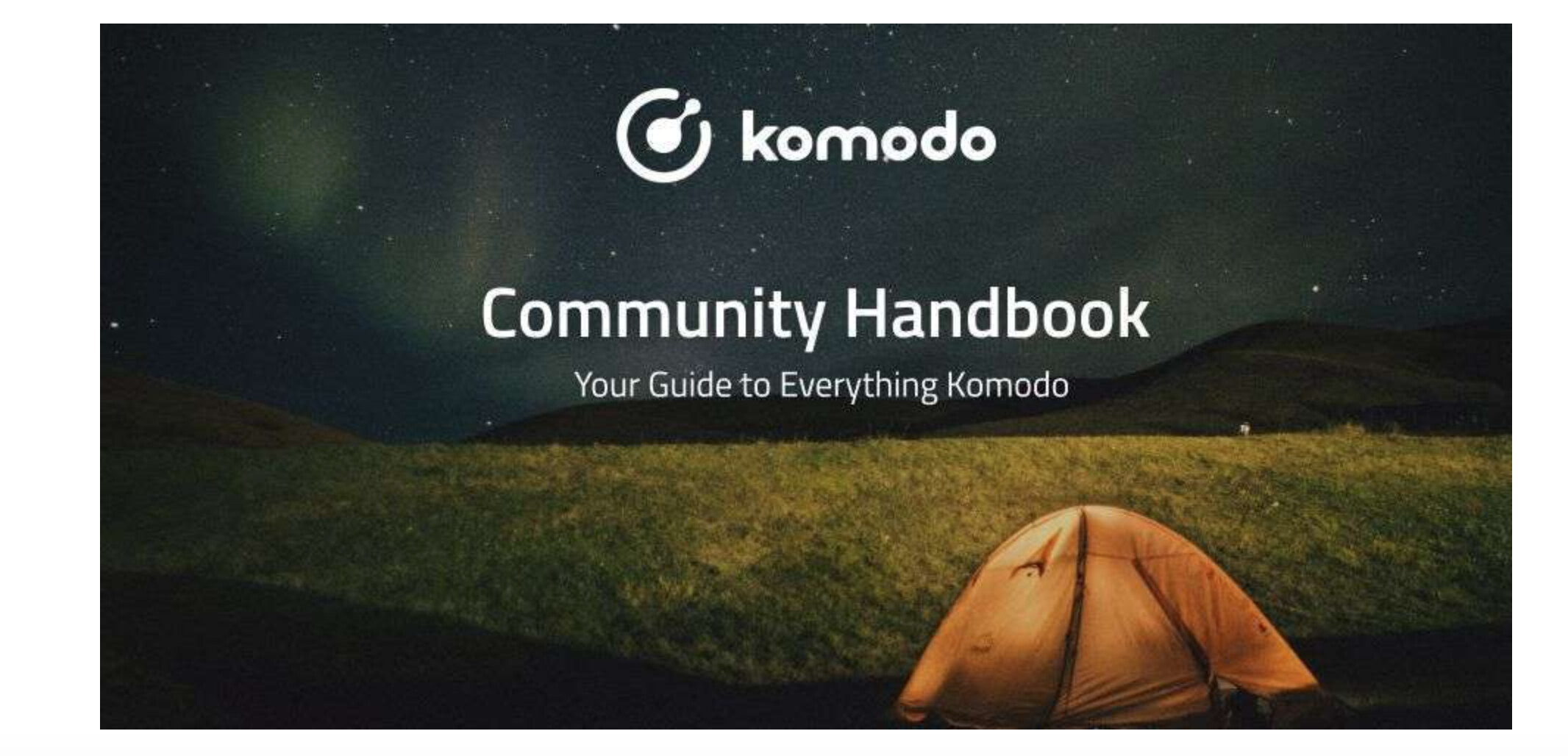
Also for the community page, it should have a warm, welcoming feeling like a camp set up with stars in the background. something like this below.


 I love the clean design